Do Now's
Do Now: 1/22, Wednesday:
OLD FASHIONED HAND TINTED EFFECT
Due end of block Thursday, 1/23
- Research and download an image from the internet, preferably similar to the example in this tutorial. When searching for you image, in google images, select TOOLS - SIZE - LARGE
- Follow the directions
- When complete, post JPEG to blog and PSD files to Minor assignments in your Google Drive


Do Now: 1/21:
the overall concept is to use your ninja-like Photoshop skills to mess with your own head.

1. take a photo of yourself, ask a classmate to help you if necessary. A plain background will make your life easier - AND YES! IT MUST BE A PHOTO OF YOU, NO EXCEPTIONS
2. Use a wide variety of skills you have learned. Combine skills and techniques.
3. I'm not requiring a certain amount of skills per attempt...but for those of you who like to count, then use 3 techniques/tweaks/skills per illustration.
4. By end of block, you will submit your 2 best / most successful mutants.
5. Post JPEG to your blog.
6. Upload Photoshop file to your Google Drive, Minor Assignments
7. "A" projects demonstrate "A" level content, skill, effort, initiative, and craftsmanship.
DO NOW: 1/15 - Simple Pop Art Effect
Due end of block Thursday, 1/16
- Download an image of yourself or a person you know
- Follow the directions
- When complete, post JPEG to blog and PSD files to Minor assignments in your Google Drive


DO NOW: 1/14 - Add Sparkle Trail to a Photo
Due end of block Wednesday, 1/15

- Download an image of a person (or child) holding a wand or stick, no cartoons, Google Images: "Person with Wand"
- Look for photo with NO sparkle trail, I will be doing a "reverse image search" so please don't try to be slick
- Use an image with a interesting background not a solid color
- When complete, post JPEG to blog and PSD files to Minor assignments in your Google Drive


DO NOW: 1/13 - Transparent Type Tutorial


DO NOW: 1/6/2020
VOCAB: Copy into your Sketchbook or Notebook - when finished, show to me for MINOR Grade
Canvas Size Allows you to change the complete size of the document without adjusting the contents of the document
Clipping Path A tool or shape that’s used to cut out an image.
Cloning Pixels A function that allows you to replicate pixels from one place to another.
CMYK Stands for Cyan, Magenta, Yellow, and Key color (aka — black); this color model (also called process color, four color) is a subtractive color model used in color printing.
Color Palette A set of colors that make up the total range of colors used in graphic computers.
Double Page Spread A double page spread is a layout that extends across two pages.
DPI (Dots Per Inch) A term to describe the measure of sharpness within an image.
Drop Shadow Is a visual effect added to an image to give the impression the image is raised above the background by duplicating the shadow.
Do Now: 1/22, Wednesday:
OLD FASHIONED HAND TINTED EFFECT
Due end of block Thursday, 1/23
Due end of block Thursday, 1/23
- Research and download an image from the internet, preferably similar to the example in this tutorial. When searching for you image, in google images, select TOOLS - SIZE - LARGE
- Follow the directions
- When complete, post JPEG to blog and PSD files to Minor assignments in your Google Drive


Do Now: 1/21:
the overall concept is to use your ninja-like Photoshop skills to mess with your own head.

1. take a photo of yourself, ask a classmate to help you if necessary. A plain background will make your life easier - AND YES! IT MUST BE A PHOTO OF YOU, NO EXCEPTIONS
2. Use a wide variety of skills you have learned. Combine skills and techniques.
3. I'm not requiring a certain amount of skills per attempt...but for those of you who like to count, then use 3 techniques/tweaks/skills per illustration.
4. By end of block, you will submit your 2 best / most successful mutants.
5. Post JPEG to your blog.
6. Upload Photoshop file to your Google Drive, Minor Assignments
7. "A" projects demonstrate "A" level content, skill, effort, initiative, and craftsmanship.
DO NOW: 1/15 - Simple Pop Art Effect
Due end of block Thursday, 1/16
- Download an image of yourself or a person you know
- Follow the directions
- When complete, post JPEG to blog and PSD files to Minor assignments in your Google Drive


DO NOW: 1/14 - Add Sparkle Trail to a Photo
Due end of block Wednesday, 1/15
- Download an image of a person (or child) holding a wand or stick, no cartoons, Google Images: "Person with Wand"
- Look for photo with NO sparkle trail, I will be doing a "reverse image search" so please don't try to be slick
- Use an image with a interesting background not a solid color
- When complete, post JPEG to blog and PSD files to Minor assignments in your Google Drive


DO NOW: 1/13 - Transparent Type Tutorial
DO NOW: 1/6/2020
VOCAB: Copy into your Sketchbook or Notebook - when finished, show to me for MINOR Grade
Canvas Size Allows you to change the complete size of the document without adjusting the contents of the document
Clipping Path A tool or shape that’s used to cut out an image.
Cloning Pixels A function that allows you to replicate pixels from one place to another.
CMYK Stands for Cyan, Magenta, Yellow, and Key color (aka — black); this color model (also called process color, four color) is a subtractive color model used in color printing.
Color Palette A set of colors that make up the total range of colors used in graphic computers.
Feathering A tool used in graphic design software that makes the edges of an image appear softer.
Fill A tool used to fill selected parts of an image with a selected color.
Filter A filter is a pre-created effect that can be applied to images to acquire a certain look.
Gradient A function in graphic software that permits the user to fill an object or image with a smooth transition of colors.
Graphic Design Visual communication using text or images to represent an idea or concept. It is also a term used for all activities relating to visual design, including web design, logo design, etc.
Indents A set in or back from the margin.
Magic Wand Tool A tool in graphic software that permits the user to select fractions of an image such as areas with the same color.
Mock Up A recreation of the original printed material; could possibly contain instructions or directions.
Page Layout Deals with the setup and style of content on a page. An example of a page layout is the pages in magazines or brochures.
Rasterize An image is said to be rasterized when transformed from vector image to a bitmapped image. When opening a vector image in a bitmap-based editing program, you are generally presented with a dialog box of options for rasterizing the image.
Template Refers to a printing project’s basic details with regard to its dimensions. A general layout.
Typography The art of arranging type—which includes letters, numbers, and symbols—so that it is pleasing to the eye. This includes not only the font that is used but how it is arranged on the page: letter by letter, size, line spacing, etc.
Do Now: Thursday 1/2/20
Check your blogs:
A) Phobia Flyer-- Make sure you posted your completed Flyer with an artist's statement onto your blog (major grade) AND your rough draft sketch (minor grade).
B) Elf Yourself-- Make sure you posted your JPEG of your completed elf on to your blog (major grade) and your PSD files of your original selfie and elf background into your google drive major assignments (minor grade).
C) Name in Lights posted into your blog (major grade) and light burst tutorial posted into your blog (minor grade).
1) Complete the LIGHT BURST tutorial in Photoshop. You MUST use your FIRST NAME and LAST NAME!! When complete post your jpeg to your blog.
2) After you complete the tutorial, you will need to complete your "NAME IN LIGHTS" Assignment and post the JPEG to your Blog. Your photoshop file needs to be uploaded to your Google Drive, MAJOR ASSIGNMENTS.
Both are due end of block tomorrow, Friday.

DO NOW: Thursday, 12/12
1) VOCAB: Please show me when complete for a grade (MINOR)
2) "ELF on the Shelf" Yourself - MAJOR Grade - Due WEDNESDAY, end of block
Alignment: In graphic design, alignment refers to keeping the elements on the page connected, or aligned, so the elements, when put together, flow well. Each item placed on a page (or web site) should be somehow connected with the others for proper alignment.
Font pairing: selecting two to three fonts to use in a design that complement each other in order to more clearly communicate the message of the design.
Hierarchy: is the organization of elements on the page to draw the reader's eye to the first, second, and third most important messages to be communicated.
typeface: A set of glyphs designed according to common principles; it is the overall appearance of a complete set of characters.
Body Copy: The main part of text in your design or publication – the written website content, the book contents, even this type you’re reading right now, it’s all body copy.
Weight: Refers to the heaviness of the stroke for a specific font, such as Light, Regular, Book, Demi, Heavy,Black, and Extra Bold.
Width: Refers to whether the standard typeface has been extended or compressed horizontally. The common variations are Condensed, Normal, or Extended.
Rasterization: Converting an image from vector to raster (pixels or dots)
Serif: Small stroke at the beginning or end of main strokes of a letter
Justified: In a paragraph of justified text, when the contents are arranged so that there is no white space at the end of a line: each begins flush left and finishes flush right.
Kearning: The art of adjusting the proximity of adjacent letters to optimise their visual appeal and readability.
Leading: Leading describes the vertical space between each line of type. In olden times actual strips of lead were used to separate lines of text vertically; the naming convention persists.
1) VOCAB: Please show me when complete for a grade (MINOR)
2) "ELF on the Shelf" Yourself - MAJOR Grade - Due WEDNESDAY, end of blockDo Now: Wednesday, Dec 11th
Complete the following tutorial, when complete, post to your blog (MINOR GRADE) due at the end of block. After you finish the tutorial, work on your phobia flyer which is due Friday, 12/13.
Photoshop Tutorial: Blemishes
In this Photo Retouching tutorial, we’ll look at one of the most amazing and time saving photo retouching tools available, the Spot Healing Brush, the first of three image "healing" tools in Photoshop.
 Follow the STEP BY STEP TUTORIAL. Use a photo you already have on your phone or take a selfie. You will have to show a before and after photo for a grade.
Save and Post to your Blog when complete (Minor Grade)

Do Now: Monday, 12/22
Complete the following tutorial, when complete, post to your blog (MINOR GRADE) due at the end of block Wednesday, 12/4
Don't it make my brown eyes...Don't it make my brown eyes...Don't it make my brown eyes blue...
Today, you will be changing your own eye color. Please follow this great tutorial to make your eyes 3 different colors, 2 realistic and one fantasy.
Instructions:
1. Take a close up photo of one of your eyes, ask a friend to help if needed.
2. Download the image to your desktop and open in Photoshop
3. Resize the image to 4" x 6" at 300 dpi
4. Follow the directions in the video (link below)
5. Save each eye as a jpg and post to your blog.
6. If you want to get fancy, combine all 3 into one image and save as a jpg
Post to your blog for a minor grade. DUE at the END of BLOCK - Wednesday!
Post to your blog for a minor grade. DUE at the END of BLOCK - Wednesday!
Friday, 11/22:
1. VOCAB: Copy into your Sketchbook or Notebook - when finished, show me for MINOR Grade
2. Complete "Silent Spring" assignment, due today.
3. Work on Tutorial #3, due EOB Wednesday, 11/27 click on link below
FIND YOUR OWN IMAGES - you can search images and use .png to find images with a transparent background
Six Elements of Design – Six basic elements are used to create an attractive graphic design project. These include line, shape, value, space, texture and color.
Typography – The art of arranging type, which includes letters, numbers and symbols, so that it is pleasing to the eye. This includes not only the font that is used but how it is arranged on the page: letter by letter, size, line spacing, etc. Typography is an important part of creating a pleasing final graphic design product.
Texture – A graphic design term that refers to creating depth to a graphic design product so they have dimension rather than appearing flat. This can be done through the use of patterns behind color, for instance.
Vector image – A vector image, such as a logo, is one that can be easily resized without loss of quality.
logogram: a single written symbol that represents an entire word or phrase without indicating its pronunciation
Sans serif: A style of typeface in which there are no small lines at the end of each character stroke. Common sans serif typefaces include Arial, Helvetica and Verdana.
Lorem ipsum: Lorem ipsum is a form of “filler” used as a placeholder for text in a design. This scrambled Latin text allows designers to create design layouts without having access to the final written copy.
Vector graphic: An image made up of paths and curves (vectors) rather than a grid of pixels. Unlike raster images, these are able to be enlarged without losing image quality. Vector graphic file extensions include .EPS, .AI, .SVG and .DRW.
Bitmap: Defines a display space and the color for each pixel or “bit” in the display space. It is characterized by the number of pixels and the information content per pixel.
JPEG: A JPEG is an example of a graphic image file type that contains bitmaps. It is created for compressing full-color or grey-scale digital images of real-world scenes. It was not designed for lettering or cartoons.
Pixel: The smallest unit of a digital image or graphic that can be displayed and represented on a digital display device.
Wednesday, 11/13:
VOCAB: Copy into your Sketchbook or Notebook - when finished, show me for MINOR Grade
AFTER: Complete TUTORIAL Below
PRINCIPLES OF DESIGN -
The principles of design describe the ways that artists use the elements of art in a work of art.
Balance is the distribution of the visual weight of objects, colors, texture, and space.
If the design was a scale, these elements should be balanced to make a design feel
stable. In symmetrical balance, the elements used on one side of the design are
similar to those on the other side; in asymmetrical balance, the sides are different
but still look balanced. In radial balance, the elements are arranged around a central
point and may be similar.
Emphasis is the part of the design that catches the viewer’s attention. Usually the
artist will make one area stand out by contrasting it with other areas. The area could
be different in size, color, texture, shape, etc.
Movement is the path the viewer’s eye takes through the work of art, often to focal
areas. Such movement can be directed along lines, edges, shape, and color within the
work of art.
Pattern is the repeating of an object or symbol all over the work of art.
Repetition works with pattern to make the work of art seem active. The repetition
of elements of design creates unity within the work of art.
Proportion is the feeling of unity created when all parts (sizes, amounts, or number)
relate well with each other. When drawing the human figure, proportion can refer
to the size of the head compared to the rest of the body.
Rhythm is created when one or more elements of design are used repeatedly to
create a feeling of organized movement. Rhythm creates a mood like music or
dancing. To keep rhythm exciting and active, variety is essential.
Variety is the use of several elements of design to hold the viewer’s attention and
to guide the viewer’s eye through and around the work of art.
Unity is the feeling of harmony between all parts of the work of art, which creates
a sense of completeness.
VOCAB: Copy into your Sketchbook or Notebook - when finished, show me for MINOR Grade
AFTER: Complete TUTORIAL Below
PRINCIPLES OF DESIGN -
PRINCIPLES OF DESIGN -
The principles of design describe the ways that artists use the elements of art in a work of art.
Balance is the distribution of the visual weight of objects, colors, texture, and space.
If the design was a scale, these elements should be balanced to make a design feel
stable. In symmetrical balance, the elements used on one side of the design are
similar to those on the other side; in asymmetrical balance, the sides are different
but still look balanced. In radial balance, the elements are arranged around a central
point and may be similar.
Emphasis is the part of the design that catches the viewer’s attention. Usually the
artist will make one area stand out by contrasting it with other areas. The area could
be different in size, color, texture, shape, etc.
Movement is the path the viewer’s eye takes through the work of art, often to focal
areas. Such movement can be directed along lines, edges, shape, and color within the
work of art.
Pattern is the repeating of an object or symbol all over the work of art.
Repetition works with pattern to make the work of art seem active. The repetition
of elements of design creates unity within the work of art.
Proportion is the feeling of unity created when all parts (sizes, amounts, or number)
relate well with each other. When drawing the human figure, proportion can refer
to the size of the head compared to the rest of the body.
Rhythm is created when one or more elements of design are used repeatedly to
create a feeling of organized movement. Rhythm creates a mood like music or
dancing. To keep rhythm exciting and active, variety is essential.
Variety is the use of several elements of design to hold the viewer’s attention and
to guide the viewer’s eye through and around the work of art.
Unity is the feeling of harmony between all parts of the work of art, which creates
a sense of completeness.
Photoshop Introduction 1
View the following intro and complete instructions below: DUE Friday 11/15 end of class.
- You will need to open Adobe Photoshop.
- Go to Start and Find Adobe Photoshop, it will either be in your top list of applications or you will need to find it in the Adobe folder.
- Minimize the screen so you have can have both windows open, one to watch the video and the other to look at the application.
- Save whatever you created today as a JPEG.
- Post me on your Blog for a minor grade.
Photoshop Tutorial 2 - Masking
Please complete the following tutorial and save as JPEG and post to you blog. DUE on Tuesday 11/19 end of block

Please complete the following tutorial and save as JPEG and post to you blog. DUE on Tuesday 11/19 end of block

Welcome back!
I hope you had a restful break!
Grades are due this week for the first marking period. Today you will be given the block to finish incomplete work as most of you do not have adobe illustrator at home. Remember as you complete assignments and post them to your blog to make me aware so I can then review your blog.
Tuesday, 10/29:
Happy Halloween week!
You will be creating your own Frankenstein! FOLLOW the directions in google classroom for a spooky time! Post to your blog when complete!
Grades for the following will be added in Genesis this week:
Majors: Mosaics, 3D Prize, Frankenstein
Minors: Prize Practice, Prize Rough Draft, Monthly Observations 10/21-10/25
Ensure you have everything posted in your blog in the CORRECT area, i.e. monthly observations are all on the same page. Follow directions and make sure you exported correctly and posted it or added it to your google drive.

Monday, 10/21:
You will begin designing your 3D prize for your cereal box in Tinkercad.com
Welcome back!
Grades are due this week for the first marking period. Today you will be given the block to finish incomplete work as most of you do not have adobe illustrator at home. Remember as you complete assignments and post them to your blog to make me aware so I can then review your blog.
Tuesday, 10/29:
Happy Halloween week!
You will be creating your own Frankenstein! FOLLOW the directions in google classroom for a spooky time! Post to your blog when complete!Grades for the following will be added in Genesis this week:
Majors: Mosaics, 3D Prize, Frankenstein
Minors: Prize Practice, Prize Rough Draft, Monthly Observations 10/21-10/25
Ensure you have everything posted in your blog in the CORRECT area, i.e. monthly observations are all on the same page. Follow directions and make sure you exported correctly and posted it or added it to your google drive.
Monday, 10/21:
You will begin designing your 3D prize for your cereal box in Tinkercad.com
3D Printing:
- Go to TINKERCAD.com and log-in using your school google account
- The screen "Ready to learn the moves?" will pop up
- Click "Let's Go"
- Work through all the tutorials to get an understanding on how to use the program
- Create your first piece - it can be anything.
- Export as an STL file and upload to your Google Drive in MINOR ASSIGNMENTS
- Draw a rough draft on paper of what you want your prize to look like - SEE ME, and turn in for a grade.
- In TINKERCAD.com - create your Prize
- You can also check out Thingiverse.com for downloadables. if you use any pre-made files you must customize it.
- Once you are done with your design, save for 3D printing as an STL file and upload to your Google Drive - Major Assignments.
- Label the file: FirstNameLastName_prize.stl
Thursday 10/10:
Please copy the following vocab in your sketchbook - I will be checking it when you are complete. (Graded)
Complementary colors – The colors that are opposite of each other when viewed on the color wheel.
DPI – DPI, or dots per inch, refers to the clarity of an image due to the number of dots of ink that make up a picture that is printed on paper.
Focal point – In graphic design terms, the focal point is where you want to draw the reader’s or viewer’s eye. This may be large or it may be small. Sometimes graphic designers create a focal point by placing only one tiny object on a page, and in this case the focal point is obvious. Other times the focal point may be within a variety of elements.
Grid – An important concept in graphic design, grids are often used in layouts for both web and print projects. Grids help graphic designers arrange text and images on the page in a way that will look even, attractive and consistent throughout. Grids can be used on paper or can be set up in graphic design software, such as Photoshop.
Negative space – The area on a page that is left without images and words is referred to as negative or white space. This negative or white space is very important in graphic design projects.
Raster images – These images are created using thousands of pixels. They are not easily resized as are Vector images; enlarging a raster image too much will diminish quality. Photographs are an example of a raster image.
Resolution – Number of dots per inch, or dpi, in an image. Images for the web are usually be around 72 dpi, or a low resolution, while images for print should be around 300 dpi, or a higher resolution.
RGB – This color mode is used for web design, digital cameras, scanners and other electronics and combines the colors red, green and blue to create what is seen on the screen.
 Do Now: Thursday, October 3rd
Good morning! Today you will continue to work on:
1) your mandala's
2) your character's
3) your monthly observations
As you post assignments, please remember to let me know so I can check your blog. Continue to check Genesis as progress reports are upon us.
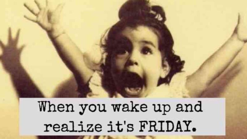
Take note of today's meme! Please continue to utilize each other as resources when questioning steps in illustrator as well as researching on google and you tube. Studies show that when we discover the answers to our questions on our own and with our peers, we better retain that knowledge!

Do Now: Tuesday, October 1st
Please complete the following tutorial - POST to your blog by the end of class

Do Now: Monday, September 30, 2019
Continue building your character in Illustrator. Refer to the tutorial in the Assignment page.
Do Now: Friday September 27, 2019
Continue working on creating your Character in Illustrator. Refer to the tutorial in the Assignment page.
Do Now: Wednesday, September 25, 2019
Please copy the following vocab in your sketchbook - I will be checking it when you are complete. (Graded)
Serif vs. Sans Serif– Serifs are the semi-structural details on the ends of some strokes of letters and symbols; typefaces without these projections are known as sans serifs. EXAMPLE: Times New Roman (Serif) ARIAL (Sans Serif)
Character– single letter, number, or other symbol used to represent information
Alignment– how text/images line up with each other. They can be aligned on the left, right, center, or justified
Tracking, Kerning and Letterspacing – control the distance between characters. Tracking is adjusted to change the space between characters consistently across a block of text. Kerning is the reduction of space between characters, and letterspacing is the addition of space between characters.
Typeface – A typeface refers to a group of characters, such as letters, numbers, and punctuation, that share a common design or style. Times New Roman, Arial, Helvetica and Courier are all typefaces.
Type Families – The different options available within a font make up a type family. Many fonts are at a minimum available in roman, bold and italic. Other families are much larger, such as Helvetica Neue, which is available in options such Condensed Bold, Condensed Black, UltraLight, UltraLight Italic, Light, Light Italic, Regular, etc.
Weight – Refers to the heaviness of the stroke for a specific font, such as Light, Regular, Book, Demi, Heavy,Black, and Extra Bold.
Width – Refers to whether the standard typeface has been extended or compressed horizontally. The common variations are Condensed, Normal, or Extended.
Do Now: Monday, September 23rd
After you have completed your 3D Type Tutorial and posted to your blog!
DESIGN YOUR NAME:
Thursday 10/10:
Please copy the following vocab in your sketchbook - I will be checking it when you are complete. (Graded)
Complementary colors – The colors that are opposite of each other when viewed on the color wheel.
Focal point – In graphic design terms, the focal point is where you want to draw the reader’s or viewer’s eye. This may be large or it may be small. Sometimes graphic designers create a focal point by placing only one tiny object on a page, and in this case the focal point is obvious. Other times the focal point may be within a variety of elements.
Grid – An important concept in graphic design, grids are often used in layouts for both web and print projects. Grids help graphic designers arrange text and images on the page in a way that will look even, attractive and consistent throughout. Grids can be used on paper or can be set up in graphic design software, such as Photoshop.
Negative space – The area on a page that is left without images and words is referred to as negative or white space. This negative or white space is very important in graphic design projects.
Raster images – These images are created using thousands of pixels. They are not easily resized as are Vector images; enlarging a raster image too much will diminish quality. Photographs are an example of a raster image.
Resolution – Number of dots per inch, or dpi, in an image. Images for the web are usually be around 72 dpi, or a low resolution, while images for print should be around 300 dpi, or a higher resolution.
RGB – This color mode is used for web design, digital cameras, scanners and other electronics and combines the colors red, green and blue to create what is seen on the screen.
Good morning! Today you will continue to work on:
1) your mandala's
2) your character's
3) your monthly observations
As you post assignments, please remember to let me know so I can check your blog. Continue to check Genesis as progress reports are upon us.
Take note of today's meme! Please continue to utilize each other as resources when questioning steps in illustrator as well as researching on google and you tube. Studies show that when we discover the answers to our questions on our own and with our peers, we better retain that knowledge!
Do Now: Tuesday, October 1st
Please complete the following tutorial - POST to your blog by the end of class

Do Now: Monday, September 30, 2019
Continue building your character in Illustrator. Refer to the tutorial in the Assignment page.
Do Now: Friday September 27, 2019
Continue working on creating your Character in Illustrator. Refer to the tutorial in the Assignment page.
Do Now: Wednesday, September 25, 2019
Please copy the following vocab in your sketchbook - I will be checking it when you are complete. (Graded)
Serif vs. Sans Serif– Serifs are the semi-structural details on the ends of some strokes of letters and symbols; typefaces without these projections are known as sans serifs. EXAMPLE: Times New Roman (Serif) ARIAL (Sans Serif)
Character– single letter, number, or other symbol used to represent information
Alignment– how text/images line up with each other. They can be aligned on the left, right, center, or justified
Tracking, Kerning and Letterspacing – control the distance between characters. Tracking is adjusted to change the space between characters consistently across a block of text. Kerning is the reduction of space between characters, and letterspacing is the addition of space between characters.
Typeface – A typeface refers to a group of characters, such as letters, numbers, and punctuation, that share a common design or style. Times New Roman, Arial, Helvetica and Courier are all typefaces.
Type Families – The different options available within a font make up a type family. Many fonts are at a minimum available in roman, bold and italic. Other families are much larger, such as Helvetica Neue, which is available in options such Condensed Bold, Condensed Black, UltraLight, UltraLight Italic, Light, Light Italic, Regular, etc.
Weight – Refers to the heaviness of the stroke for a specific font, such as Light, Regular, Book, Demi, Heavy,Black, and Extra Bold.
Width – Refers to whether the standard typeface has been extended or compressed horizontally. The common variations are Condensed, Normal, or Extended.
Do Now: Monday, September 23rd
After you have completed your 3D Type Tutorial and posted to your blog!
DESIGN YOUR NAME:
The Project:
- Design your first and last name (middle name is optional)
- on a 500 px wide x 400px tall space.
- Research typeface specimens from various sources as well as what is loaded on the lab. Check out DAFONT.COM - we can't download any of those fonts but there is a work around
- Write down 2 to 3 adjectives that best describes your personality or spirit. Then find typefaces that you believe express' your personality or spirit.
- Give careful consideration to the positive and negative space relationships and the space between the letterforms.
- Objective: This first exercise is designed to familiarize you with type as a pure design element as well as to communicate verbal language.
- Post to your Blog as a NEW POST - include your 2 to 3 adjectives that best describe your personality.
Do Now: Friday, September 20th
3D Style Retro Text Effect Tutorial
In this tutorial you’ll learn how to create dimensional text inspired by vintage packaging designs and logotypes. Pour a cup of coffee, sit back, and let’s create some text with the help of Illustrator effects, the Blend Tool, and textures fit for the branding of a coffee house.
Final Image

Step 1
- In Adobe Illustrator, Select FILE, NEW, PRINT, US LETTER
- Start with your font of choice. In this case, I chose Lobster 2, but you choose GILL SANS MT EXT CONDENSED BOLD. FONT SIZE: 105 pts
- Write out your text or title with the Type Tool (T). I chose “Italian Roast”, but you will use your FIRST AND LAST NAME
- Select your name, then expand your text under Object, and then Ungroup your text. This will outline your letters individually.


Step 2
- I think one of your words needs a flourish, I chose “Roast." You choose the last letter in your last name
- Using the Paintbrush Tool (B) I drew a swooping line from the letter “T” that moves to the left and stops below the “R”. I made sure to have the line start from under the T so it is easy to connect later.
- Apply a thick stroke to the path in the Stroke panel (under window).
- Use your selection tool and your anchor points to taper the tail of the flourish to make the path thinner at that end.
- Once you’ve got the flourish in a position and shape that you enjoy, Expand it in Object and Group together with your word (in this case it’s been Grouped with “Roast”). You have to select both the letter and the flourish in order to group using the pathfinder tool and combining the shapes.

Step 3
- In order to make sure the flourish drawn in the previous step fits in with the text group seamlessly,
- Zoom (Z) in so you can work on the details of the final letter.
- I’ve used the Pen Tool (P) in order to draw a shape that hides the little kick on the end of the “T” and flows into the expanded flourish path.

Step 4
- I’ll mainly focus on the word “Italian” in this tutorial, since the process for the text treatment is the same for both word groups.
- Select the “Italian” group and hit Unite in the Pathfinder panel.
- With the newly compound shape selected, go to Effect > 3D > Extrude & Bevel and apply the following attributes:
X Axis: 7°
Y Axis: 12°
Z Axis: 0°
Extrude Depth: 50pt
Surface: Plastic Shading

- I’ll mainly focus on the word “Italian” in this tutorial, since the process for the text treatment is the same for both word groups.
- Select the “Italian” group and hit Unite in the Pathfinder panel.
- With the newly compound shape selected, go to Effect > 3D > Extrude & Bevel and apply the following attributes:
Y Axis: 12°
Z Axis: 0°
Extrude Depth: 50pt
Surface: Plastic Shading

Step 5
- With your new 3D text selected, Expand Appearance under Object and Ungroup.
- Select the face of the text (the letters without their 3D counterpart) and set the fill color to a light color: cream, pale mint, etc.
- Group together the 3D components of lettering. We’ll be adjusting the fill colors of those pieces in the following steps.

Step 6
You’ll need two colors for the 3D components of your text. In this case I chose teal and darker teal.
- Using the Direct Selection Tool (A), select the bottom components of the 3D text and apply the darkest shadow color as the fill color (see below).
- For anything that is on the right side of each letter and not a part of a curve, apply the lighter shadow color as the fill color (see below).

Step 7
- For curving shapes in the 3D text, you’ll apply a Linear Gradient going from the lighter shadow color to the darker shadow color using the Gradient panel to sort out the gradient’s angle.
- I’ve circled the sections of the 3D portion of the text where the gradients were placed. Once satisfied with the shadow colors and gradients of the 3D text, make sure it’s all Grouped together and Unhide the rest of your text.
- Repeat Steps 4-7 on any other text you may have in your artboard.

Step 8
- Select the face of your text (the group from Step 5), Copy (Control – C), Paste (Control – V), and go to Object > Path > Offset Path… where you’ll apply a -1px Offset.
- With both the copied text face and the offset object selected, hit Minus Front in the Pathfinder panel. For the fill color, choose something lighter than the text’s face color (light cream, seen below). Copy and Paste this outline shape and apply a color darker than the mint used for the face of the text.

Step 9
- Place this second outline shape to the right of the light cream outline shape and below it in the Layers panel. Copy, Paste, and Align (in the Align panel) the text’s face group with itself.
- With the copied face and the green outline shape selected, hit Control-7 in order to create a Clipping Mask.
- Repeat Steps 8-9 on your other text (if applicable).

Step 10
- Group your text together, Copy, and Paste. Unite the Pasted text group in Pathfinder.
- Set the fill color to an even darker color (in this case a very dark teal) and place it behind the text group in the Layers panel.
- Move it to the left and downward (see below) so it forms a bit of a drop shadow.

Step 11
- The background I’ve been using (whose texture was not covered in this tutorial, since it’s not a part of the final piece) is much too light for this color scheme.
- Using the Rounded Rectangle Tool, I drew a rounded rectangle over the artboard, behind the text groups, in a green-gray color.

- The background I’ve been using (whose texture was not covered in this tutorial, since it’s not a part of the final piece) is much too light for this color scheme.
- Using the Rounded Rectangle Tool, I drew a rounded rectangle over the artboard, behind the text groups, in a green-gray color.

Step 12
Repeat Step 10 and give any other text a simple drop shadow.

Repeat Step 10 and give any other text a simple drop shadow.

Step 13
- Copy and Paste the drop shadows twice into two separate groups.
- Reduce the Opacity of the second group to 10% in the Transparency panel.
- Make sure it has been moved to the left and downward from the first group.
- Use the Blend Tool (W) to apply a smooth blend of 45 Steps.
- Place this blend group behind the drop shadows and text.

Step 14
- For the texture used over the top of the final piece, Copy and Paste the background rounded rectangle, but make sure it’s above the other layers in the Layers panel.
- Set the fill color to dark gray and go to Effect > Pixelate > Mezzotint.
- Choose Medium Lines as the Mezzotint type.
- In the Transparency panel, set the Blend Mode to Soft Light and Opacity to 43%.

Great Job, You’re Done!
You’ve done it! Your retro text has been given a kick in the right direction. Play with long shadow shapes behind the text, add in other flourishes, effects, and designs in order to take this fairly simple text effect to the next level.

Export as a JPEG or PNG file and post to your blog!
You’ve done it! Your retro text has been given a kick in the right direction. Play with long shadow shapes behind the text, add in other flourishes, effects, and designs in order to take this fairly simple text effect to the next level.

Export as a JPEG or PNG file and post to your blog!
Do Now: 9/19
Vocab - Your favorite! Please write in your sketchbook and bring to me when you are done for a grade.
The Principles of Design:
Balance - This refers to the ways one can achieve visual balance in a design using ways such as symmetrical, radial, formal, and informal methods. There is also the rule of “thirds” on a visual platform that one can use to achieve balance.
Proximity/Unity - Keeping like items together and creating unity by how close or far apart elements are from each other.
Alignment - While centered text has its place, it is often the mark of a novice designer. Learn how to align text and graphics to create more interesting, dynamic, or appropriate layouts.
Repetition- Get an understanding of the importance of consistency for the reader and ways to create a consistent and balanced look through different types of repetition.
Contrast- Big vs. small, black vs. white. These are some ways to create contrast and visual interest.
White Space- The art of nothing is another description for this principle. View examples of the use of white space in design to determine what does and doesn't work.
After I check your vocab, you will finish your business cards and then start your next monthly observations. Ensure your pre-test is complete as well.
After I check your vocab, you will finish your business cards and then start your next monthly observations. Ensure your pre-test is complete as well.
Do Now: 9/18/2019
:max_bytes(150000):strip_icc()/humpdayfunnycamelfacememe-5af498a718ba0100374a96fd.jpg)
It's Wednesday!
1) Go to your Google Classroom and complete the 2019 Graphic Design Pre-Test, this grade does not effect your grade in Genesis
2) After, you will continue on your Business Card Assignment. When you are finished, save it to your desktop, exporting it as a JPEG and post it to your blog.
Do Now: Friday 9/13
Read the following and visit the sites listed below, we will discuss as a class shortly.
Answer questions at the bellow - Post your answers on your blog as a new post. Include the original questions. You must read the articles to answer the questions.
In the business world people often exchange business cards with new contacts, customers or suppliers. This gives them quick and easy access to basic information and contact details.
A single 3.5" by 2" card contains all the information that the people share. After returning to the office and looking at that business card again, will the recipient truly remember the person related to the card? Will the words and images on the card help? Will the business card do its job?

Sites:
What is typography:
https://www.creativebloq.com/typography/what-is-typography-123652
Elements of a Business Card:
https://www.lifewire.com/designing-a-business-card-1077303
Choose your color palette:
Use: https://color.adobe.com to create 3-5 different options of color pallets that you would like to use in this assignment
Business Card Planning
- What information needs to be on the card?
- What do you want to communicate about yourself and your imaginary business?
- How will you incorporate your logo?
- What colors have you chosen to use and why? (you can post screen shot of colors)
- Who is the intended audience?
- What impact do you want the business cards to have when they are handed out?
- What is the most important information to be conveyed?
- How does your audience impact the font family you will use?

____________________________
Do Now: Thursday 9/12
Good Morning!
1) Check Genesis for any missing assignments, by now you should have posted your NON-REP, Cheeseburger, and have turned in your signed form, completed your blogger with your about me page, completed and handed in your vocab and panel tools, and shared your google Drive.
2) Complete the Tutorial below - post as JPEG on your Blog (TITLE: Tutorial #2, Pathfinder
Adobe Illustrator Tutorials: The Pathfinder Panel, PART 1
(Open Illustrator, FILE, NEW, LETTER, then click WINDOW, click Pathfinder)
Follow step by step:
Starting with pretty basic shapes in Illustrator can end up in quite complex and interesting layouts. If you combine ellipses, rectangles and other lines you can produce complicated paths otherwise impossible (or I would rather say extremely time consuming) to achieve with the Pen tool alone. The tool needed for doing that is the Pathfinder Panel.

If we take a look at the panel we see that there are two rows of icons. The first row of icons (Shape Modes) creates compound shapes while the second one (Pathfinders) creates similar results but it focuses mainly on the paths themselves rather than the produced shape itself. Let’s see what each icon is doing.
a. Add to shape area 
Supposing you have the following two rectangles.

If you select both and click on this button in fact you are adding the one shape to the other resulting in a shape that combines these two rectangles.


The combined result gets a yellow fill, since stacking order of the shapes is important when performing the pathfinder operations. Attributes of the top shape will be used by Illustrator for the combined result properties. By using the direct selection tool  you can make adjustments of each one of the two shapes directly updating the resulting compound shape. For example, try moving the lower right rectangle further to the right as seen below.


you no longer have the ability to separately manipulate each individual shape and what you get is ONE FINAL shape for further actions. If you want to add the two shapes and expand to one final shape in one step, then press and hold the ALT key and click on the add button. It saves you time, as long as you are sure about the final shape.
b. Subtract from Shape Area 
Let’s go back to our two initial rectangles (Create two new ones).

If you select both and click on the Subtract button, then you subtract the top most shape from what lies beneath it. So if you perform the operation you get the following result.

Like before, you can adjust the appearance of the resulting shape by editing each one of the components separately. Here, with the direct selection tool I’ve moved the subtracted shape diagonally towards the upper left corner.


Click on the expand button and you get the final ONE shape.
c. Intersect shape areas 
If we create two rectangles again, and click on the Intersect button, we get a compound shape that is only the Intersecting area of the two rectangles. Click on the expand button and you produce a small yellow rectangle.


d. Exclude overlapping shape areas 
Create two new triangles again. If we click on the exclude button, then we get the inverse result. We have a shape with an empty area. This area is the overlapping area of both rectangles. Do it and you’ll end up with the following shape.


EXPORT your new shapes as a JPEG and post to your blog -
TITLE: Pathfinder Tutorial #2
Now on to... Illustrator Tutorials
Watch the following 4 tutorials (about 9 mins each):
Panels & Workspaces in Adobe Illustrator
http://youtu.be/2E9oGKd0Ayg
Artboards in Adobe Illustrator
http://youtu.be/9GbLm_WXWwk
Vector basics | Selection & Direct selection tool
Fill & Stroke effects in Adobe Illustrator (9 mins)
Do Now: Friday 9/13
Read the following and visit the sites listed below, we will discuss as a class shortly.
Answer questions at the bellow - Post your answers on your blog as a new post. Include the original questions. You must read the articles to answer the questions.
In the business world people often exchange business cards with new contacts, customers or suppliers. This gives them quick and easy access to basic information and contact details.
A single 3.5" by 2" card contains all the information that the people share. After returning to the office and looking at that business card again, will the recipient truly remember the person related to the card? Will the words and images on the card help? Will the business card do its job?
A single 3.5" by 2" card contains all the information that the people share. After returning to the office and looking at that business card again, will the recipient truly remember the person related to the card? Will the words and images on the card help? Will the business card do its job?

Sites:
What is typography:
https://www.creativebloq.com/typography/what-is-typography-123652
Elements of a Business Card:
https://www.lifewire.com/designing-a-business-card-1077303
Choose your color palette:
Use: https://color.adobe.com to create 3-5 different options of color pallets that you would like to use in this assignment
Business Card Planning
- What information needs to be on the card?
- What do you want to communicate about yourself and your imaginary business?
- How will you incorporate your logo?
- What colors have you chosen to use and why? (you can post screen shot of colors)
- Who is the intended audience?
- What impact do you want the business cards to have when they are handed out?
- What is the most important information to be conveyed?
- How does your audience impact the font family you will use?

____________________________
Do Now: Thursday 9/12
Good Morning!
1) Check Genesis for any missing assignments, by now you should have posted your NON-REP, Cheeseburger, and have turned in your signed form, completed your blogger with your about me page, completed and handed in your vocab and panel tools, and shared your google Drive.
2) Complete the Tutorial below - post as JPEG on your Blog (TITLE: Tutorial #2, Pathfinder
Adobe Illustrator Tutorials: The Pathfinder Panel, PART 1
(Open Illustrator, FILE, NEW, LETTER, then click WINDOW, click Pathfinder)
Follow step by step:
Starting with pretty basic shapes in Illustrator can end up in quite complex and interesting layouts. If you combine ellipses, rectangles and other lines you can produce complicated paths otherwise impossible (or I would rather say extremely time consuming) to achieve with the Pen tool alone. The tool needed for doing that is the Pathfinder Panel.

If we take a look at the panel we see that there are two rows of icons. The first row of icons (Shape Modes) creates compound shapes while the second one (Pathfinders) creates similar results but it focuses mainly on the paths themselves rather than the produced shape itself. Let’s see what each icon is doing.
a. Add to shape area

Supposing you have the following two rectangles.

If you select both and click on this button in fact you are adding the one shape to the other resulting in a shape that combines these two rectangles.


The combined result gets a yellow fill, since stacking order of the shapes is important when performing the pathfinder operations. Attributes of the top shape will be used by Illustrator for the combined result properties. By using the direct selection tool
 you can make adjustments of each one of the two shapes directly updating the resulting compound shape. For example, try moving the lower right rectangle further to the right as seen below.

you no longer have the ability to separately manipulate each individual shape and what you get is ONE FINAL shape for further actions. If you want to add the two shapes and expand to one final shape in one step, then press and hold the ALT key and click on the add button. It saves you time, as long as you are sure about the final shape.
b. Subtract from Shape Area

Let’s go back to our two initial rectangles (Create two new ones).

If you select both and click on the Subtract button, then you subtract the top most shape from what lies beneath it. So if you perform the operation you get the following result.

Like before, you can adjust the appearance of the resulting shape by editing each one of the components separately. Here, with the direct selection tool I’ve moved the subtracted shape diagonally towards the upper left corner.


Click on the expand button and you get the final ONE shape.
c. Intersect shape areas

If we create two rectangles again, and click on the Intersect button, we get a compound shape that is only the Intersecting area of the two rectangles. Click on the expand button and you produce a small yellow rectangle.


d. Exclude overlapping shape areas

Create two new triangles again. If we click on the exclude button, then we get the inverse result. We have a shape with an empty area. This area is the overlapping area of both rectangles. Do it and you’ll end up with the following shape.


EXPORT your new shapes as a JPEG and post to your blog -
TITLE: Pathfinder Tutorial #2
Now on to... Illustrator Tutorials
Watch the following 4 tutorials (about 9 mins each):
Panels & Workspaces in Adobe Illustrator
http://youtu.be/2E9oGKd0Ayg
Artboards in Adobe Illustrator
http://youtu.be/9GbLm_WXWwk
Vector basics | Selection & Direct selection tool
http://youtu.be/GFY0_EMVYDw
Fill & Stroke effects in Adobe Illustrator (9 mins)
http://youtu.be/xhATZA88zC4
Do Now: Wednesday, 9/11:
FIRST- Complete the tool identification sheets you will receive from me. Then...
Cheeseburger, Cheeseburger, Cheeseburger...

Do Now: Wednesday, 9/11:
Cheeseburger, Cheeseburger, Cheeseburger...
FIRST- Complete the tool identification sheets you will receive from me. Then...
Make a cheeseburger using shapes and colors.
You have 40 minutes to complete this assignment.
- Open Adobe Illustrator
- Click FILE, New
- On the NEW DOCUMENT SCREEN
- Name: YourFirstName_Burger
- New Doc Profile: PRINT
- Size: Letter
- CLICK - OK
- Now using any tool you can figure out - play around with Illustrator and create a cheeseburger.
- to Save file,
- click FILE
- Click EXPORT
- click the desktop icon,
- on bottom drop menu (SAVE as type) select, PNG
- click use artboards
- click SAVE
- Upload your Cheeseburger to the blog
- Check out to your classmates blogs and comment on at least 2
- This is a MINOR grade - you have 40 minutes to complete.
Do Now : Friday, September 6th
FIRST PAGE: About Me...
BASIC INFORMATION
- Name:
- Nickname/How you prefer to be called:
- Are you from Iselin, if not where?
- Do you have any siblings?
- Do you speak any other languages?
- Are you a morning person?
- What do you like to do on your free time?
- Do you have any pets?
- Any interesting hobbies?
- What do you imagine yourself doing in 10 years time?
Due Monday, Sept. 9th
- Name: YourFirstName_Burger
- New Doc Profile: PRINT
- Size: Letter
- CLICK - OK
- click FILE
- Click EXPORT
- click the desktop icon,
- on bottom drop menu (SAVE as type) select, PNG
- click use artboards
- click SAVE
Do Now : Friday, September 6th
FIRST PAGE: About Me...
BASIC INFORMATION
- Name:
- Nickname/How you prefer to be called:
- Are you from Iselin, if not where?
- Do you have any siblings?
- Do you speak any other languages?
- Are you a morning person?
- What do you like to do on your free time?
- Do you have any pets?
- Any interesting hobbies?
- What do you imagine yourself doing in 10 years time?
Due Monday, Sept. 9th
___________________________________
Do Now: Thurs., Sept. 5th
How to Set-up Your Folder in Google Drive
I WILL NOT grade documents that are labeled incorrectly or in the wrong folder.
- In your Google Drive, click NEW and select FOLDER
- Name your folder : FIRSTNAME LASTNAME GDesign_Fall2019
- Select your new folder
- Within that folder, click NEW and select FOLDER
- Create 3 new folders labeled:
- Major Assignments
- Minor Assignments
- Misc Files
- Return to your Google Drive
- Select the Folder labeled: FIRSTNAME LASTNAME GDesign2019
- Right click and select SHARE
- Input me email address: brooke.napoli@wtsdnj.com
- Be sure it says CAN EDIT
This will give me access to your Graphic Design files only.
__________________________
Do Now
Good Morning!
Every day you will log into your computer and go directly to this page. You will working quietly and independently and complete the daily Do Now. Sometimes I will give you additional instructions verbally but most days the Do Now will be self explanatory.
Do Now: TODAY! Weds., Sept. 4th, 2019
Every day you will log into your computer and go directly to this page. You will working quietly and independently and complete the daily Do Now. Sometimes I will give you additional instructions verbally but most days the Do Now will be self explanatory.
Do Now: TODAY! Weds., Sept. 4th, 2019
Today you'll be creating your own blog using your school gmail account.
Your Blog name should include Your First Name and Your Last Name Initial, for example:
www.JoeT.JFKGraphics.blogspot.com
You will be required to create and maintain your personal blog, while adhering to the internet rules and regulations you've signed off on in order to participate in this course.
Today you'll be creating your own blog using your school gmail account.
Your Blog name should include Your First Name and Your Last Name Initial, for example:
www.JoeT.JFKGraphics.blogspot.com
Think of your blog as your sketchbook, your very PUBLIC sketchbook.
As always, see the 'Do Now' page first, and then we'll talk about Blogging.

We'll start blogging together, but if you need the instructions, google has very detailed instructions which you can view at home this evening and continue this process at home.
POST YOUR BLOG URL on our Google Classroom assignment for credit.
DUE: Beginning of Class, Monday, Sept 9th - MINOR GRADE
_________________
_________________
_____________________________________
_____________________________________

Comments
Post a Comment